This is my attempt at creating a model which could predict the presence of the west nile virus from a given dataset. The problem was originally presented as a kaggle competition running from April to June of 2015. The full description of the problem can be found here.
Data description
The experiment to find the presence of the west nile virus was undertaken in Chicago by placing mosquito traps all over the city. The mosquitoes which would fall into the traps would be inspected periodically for presence of the virus.
The training data consists of three csv files:
- train.csv - This is the most important dataset, it logs the result of inspecting the traps and contains the following information:
- The date of observation
- The address of the trap (this is spread over several columns containing block names and street names)
- The latitude and longitude of the trap
- The name of the trap
- The species of the mosquitoes found in the trap
- The number of mosquitoes of each species
- Whether west nile virus was present or not
This data spans the years 2007, 2009, 2011 and 2013. The years left out are present in the testing dataset.
- weather.csv - This contains weather information for all the years between 2007 and 2013. The type of information involves:
- The date of the weather data
- Maximum, minimum and average temperature for that day
- Dewpoint and wetbulb
- Heat and cool
- Sunrise and sunset times
- Snowfall and total precipitation
- Pressure, sealevel and average windspeed
- Station Id
The data is collected from two stations and the station Id indicates which station the data came from.
-
spray.csv - This dataset contains the locations of those regions where a mosquito repellent spray was applied. The data is only available for 2011 and 2013.
- test.csv - This file contains the data that was stripped out of train.csv, i.e. the data for the years 2008, 2010, 2012 and 2014. The data indicating how many mosquitoes of a species were found in each trap is also removed.
Baby steps
The first thing to do with this data as my mentor pointed out was to see how the they related to each other using pairplots. Using seaborn’s pairplots function on the training data yielded a plot which worked well in showing how latitude and longitude were related to the presence of the virus but failed to show any connection between species of mosquitoes and presence of virus and between traps and presence of the virus. This was simply because these fields were in string format.
The solution for traps was very simple, the Trap id was a string like T002, so all I had to do was ignore the leading character and zeroes.
Species is divided between four categories:
- CULEX PIPIENS
- CULEX PIPIENS/RESTUANS
- CULEX RESTUANS
- CULEX SALINARIUS
-
CULEX TERRITANS
I converted this information into a one hot encoding.
This was also a good time to merge the latitude and longitude data into a single entity, I used KMeans clustering for this.
With these changes in place I generated the pairplot and this is what it looks like:
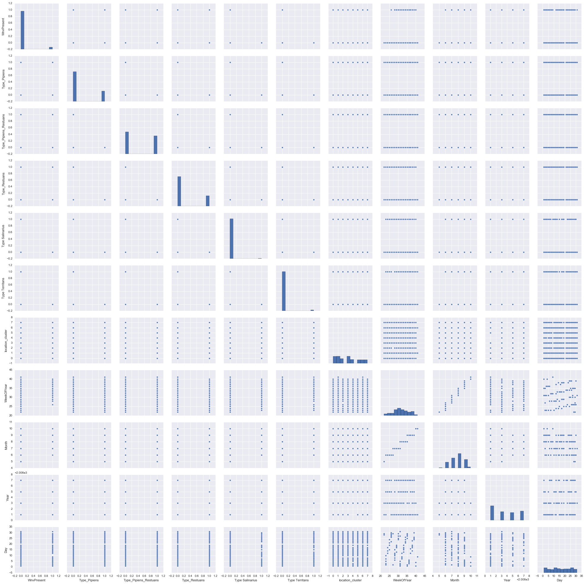
The plot indicates that Culex Salinarius and Culex Territans don’t carry the virus and can be clubbed under the common heading of ‘Other’ in the one hot encoding.
There is some interesting correlation between the month and the presence of the virus which isn’t clear in the above plot. So here is another pairplot with only that data:
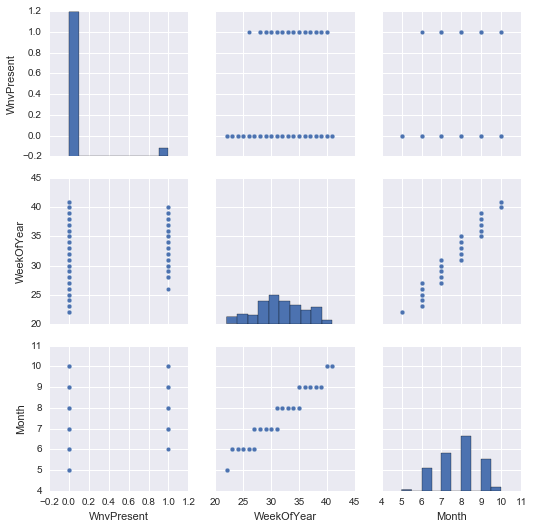
This indicates the virus is mainly present between the months of June to October, suggesting that higher temperatures may have an effect on it’s presence.
To test the veracity of this claim I generated a pairplot with just the presence of the virus and the weather data by joining the two data sets over the date. The resulting pairplot is once again quite big and a little hard to see:
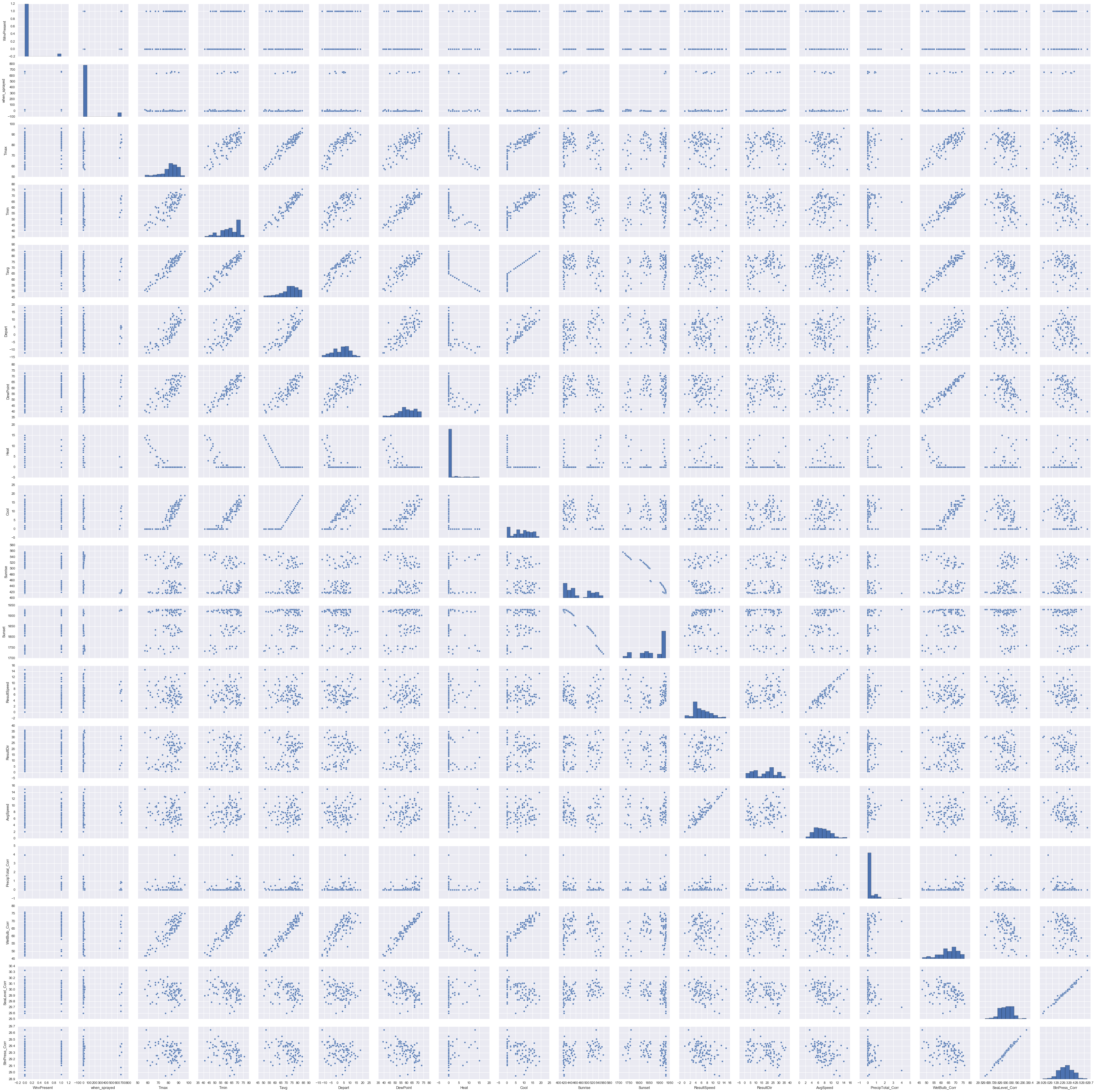
The pairplots indicate a few interesting relations such as that between sunset and sunrise which would gladden the heart of a nature lover, but leaves me cold.
The only parameter that is clearly indicated to have an effect is heat as can be seen below:
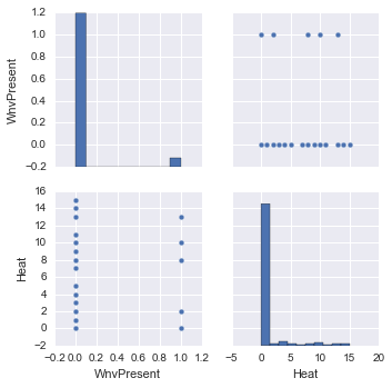
I wasn’t confident enough to ignore all the other weather parameters based on this pairplot and decided to use them all.
Early models
Ask in any forum and everyone will absolutely insist that you must try the random forest. I could hardly ignore this advice, and decided to throw in Decision Trees and a simple Gaussian Naive Bayes model in the pot.
Merging all the data
It is easy enough to merge the training data and the weather data on date since they match exactly. However spraying data rarely has an exact match over date, in fact this data is only available for 2011 and 2013.
So I created a new field called when_sprayed which would indicate the number of days since a location was sprayed. Before 2011 this field would have -1 indicating never.
Evaluation
The evaluation criteria was based on the ROC curve, which is what the graph below shows:
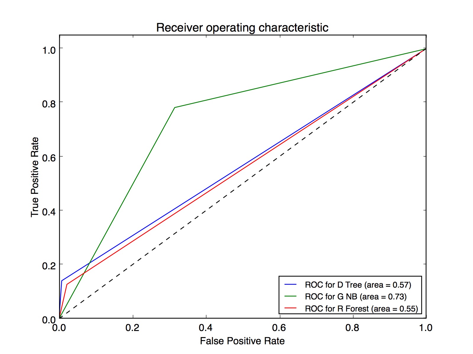
When I first saw this graph I felt the wind being knocked out of me. I had expected the graph to at the least indicate that I was headed in the right direction. Instead I was mystified by how a Gaussian Naive Bayes could out perform Decision Trees and Random forests which were only doing marginally better than blind guesswork.
Talking to my mentor however quickly resolved the issue.
I had forgotten that for Naive Bayes to work correctly all the input parameters must be mutually independent. It was easy enough to verify if that was the cause by using pandas to create the correlation matrix and plotting it as a heatmap using seaborn.
The heatmap looks as below:
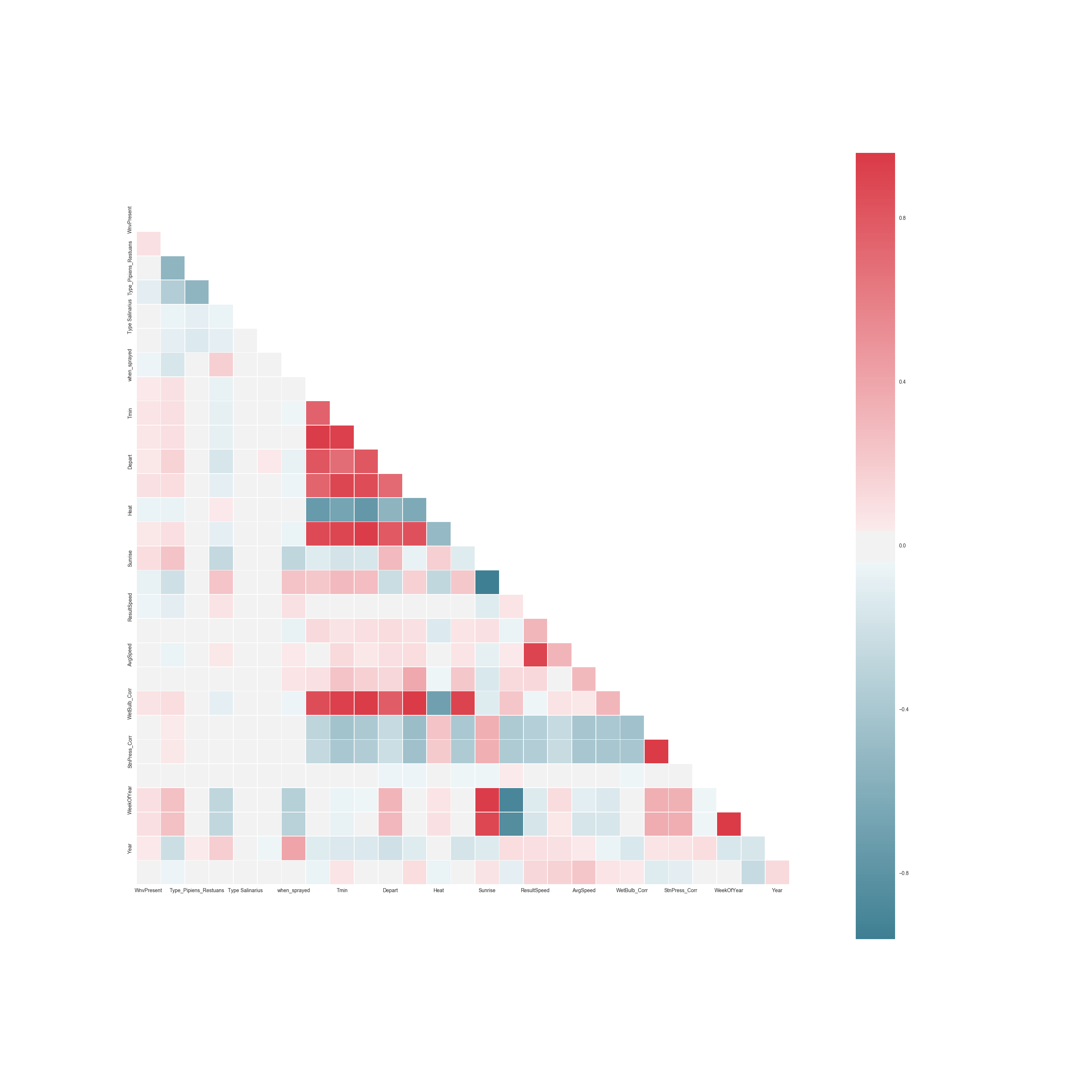
The graph makes it very clear that some attributes have very strong positive and negative correlations, which is what makes Naive Bayes look like it is working.
Some examples from the correlation matrix are:
- Tavg and Tmin have a positive correlation of 0.93 which makes sense
- Station pressure and Sea level have a positive correlation of 0.99
- Sunrise and sunset have a negative correlation of -0.95
The other mistake in my first implementation as my mentor pointed out was in my implementation of cross validation. I was randomly dividing my training set into a 90% and 10% split and was using the 90% for training and 10% for testing.
The training data is highly skewed and about 90% of the data showed an absence of the virus. This meant that it was entirely possible for my testing data to not have a single instance where the virus was present, thereby giving an unreliable score of the model’s performance.
He suggested that I look into K-fold cross validation. Looking at the scikit’s cross validation page I realized that Stratified k-fold was what I needed for such a skewed data set. If I used K-fold then it was quite possible for some folds to once again have zero instances of the virus.
So here are the ROC graphs using stratified k-fold.
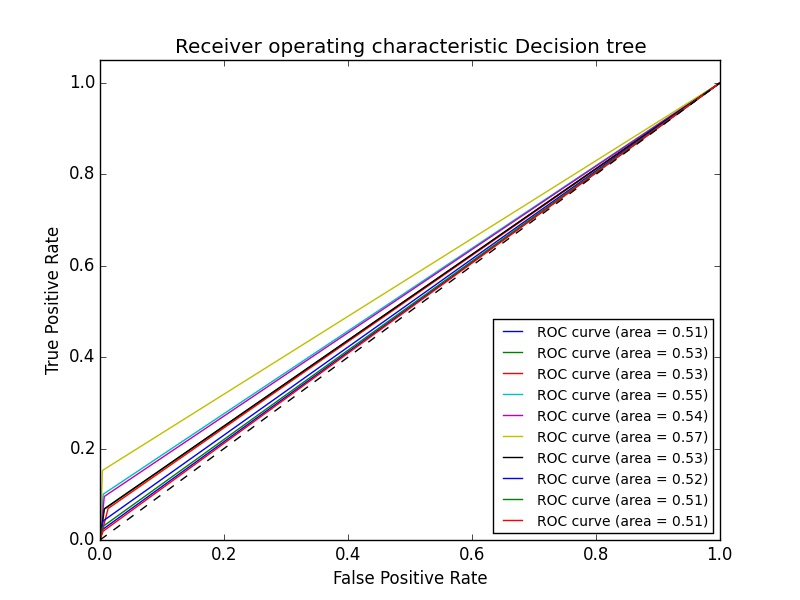
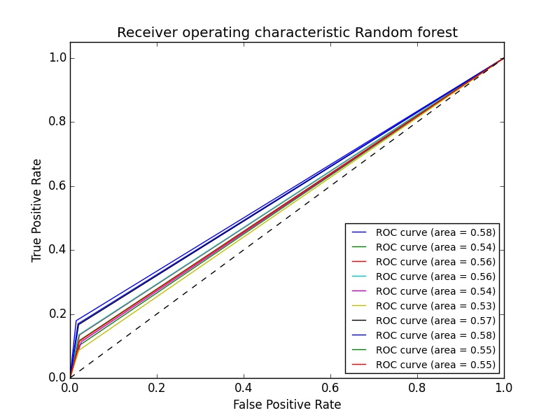
The graphs above don’t average the results, but even if they did the results wouldn’t be any better.
It was now time to get creative with the data.
Feature engineering
For a while I had no idea what to try next, so I amused myself by using the logarithmic value of Tmax and the square root of Tmax. They improved the results marginally: Using square root of Tmax gave me a score of 0.6 for random forest, a modest improvement from 0.55.
Then I had an idea: If the virus is affected by weather conditions and say today’s date shows that the virus was found. Then the weather that actually caused the virus to thrive wasn’t today’s weather, it was the weather for the last few days. Luckily the weather data set has this information, so all I had to do was include it in my dataset.
So I wrote a script which iterated through the data set and once it found a set where the virus was present, it would then append the weather data for the past N number of days to the location data of the current set. For all of these extra rows of data I’d say that the virus was present. This would have the added benefit of reducing the skewness of the data.
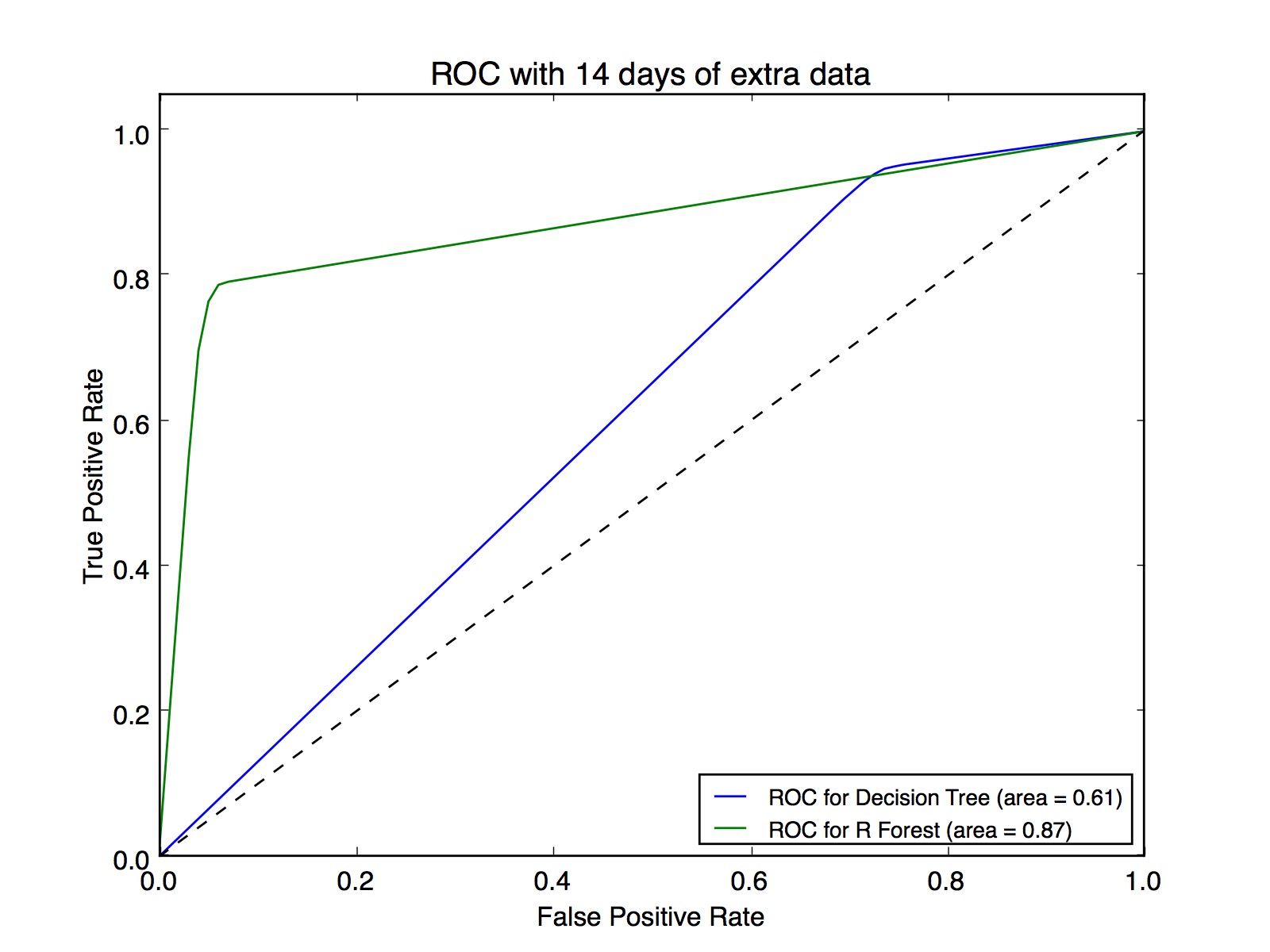
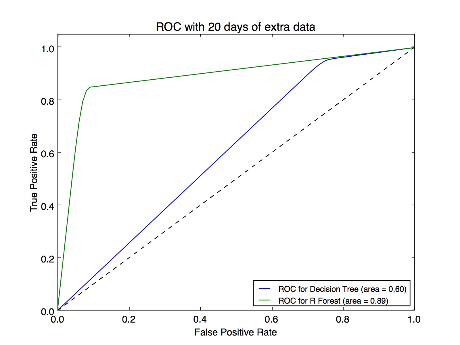
Here is the graph of the ROC using the above idea.
So I was finally on the right path!
First submission to Kaggle
At this time I decided to submit to kaggle to see where I stood. With the above submission my rank was at about 50% with a score of 0.70430.
An odd thing happened, I found that if I generated the submission file multiple times without changing anything in the model, the score would vary between 0.71344 and 0.70430. So I turned to my mentor for advice and he suggested that the most likely cause of this was because I was randomly selecting my folds without setting an initial seed value. Due to this each time the model is slightly different. This is very easy to rectify and I soon started seeing consistent results.
Tuning the model
Now I started tuning the parameters of the model. I changed number of extra days of weather information from 3 days up to 30 days. I played with the number of trees, the max depth, the minimum split and the minimum samples of the leaf until I was royally fed up.
The problem with a non linear model such as this one is that it is hard to guess which parameter would work the best. I would get the best results with number of days either equal to 14 or 20. Setting a value between these two would reduce my kaggle score. I don’t think it means my model is wrong, since the difference in score would be of about 0.0003.
So finally for my submission I settled on the following parameters:
- Number of days = 20
- n_estimators=800
- min_samples_leaf=74
- max_depth=15
- criterion=’entropy’
This gave me a score of 531 with a score of 0.73096 out of a total of 1306 submissions. The winning score was 0.85991